Here is the honest truth I wish someone had told me when I opened my first boutique: you do not need a $2,000 camera, a lightbox, or a photographer on retainer to build a catalog that sells. You need a window, a piece of foam board, and the phone already in your pocket. I have shot hundreds of listings on an iPhone, and the pieces move just fine — because the goal was never to make the jewelry look like something it isn't. It was to show it clearly, honestly, and consistently. This is the exact home workflow I use to photograph jewelry for an online store, and it is one you can teach a part-time helper in an afternoon.
Key takeaways
- Light is 90% of the job. A big north-facing window plus a white foam-board bounce beats any gadget — soft, even, and free.
- Consistency sells the grid, not just the shot. Lock one background, one distance, and one frame so your whole catalog looks like a collection, not a yard sale.
- Edit for accuracy, never fantasy. Fix brightness and white balance so gold reads as gold-plated and CZ reads as CZ — do not fake diamond fire or a color the customer won't receive.
Start with a window and a bounce card
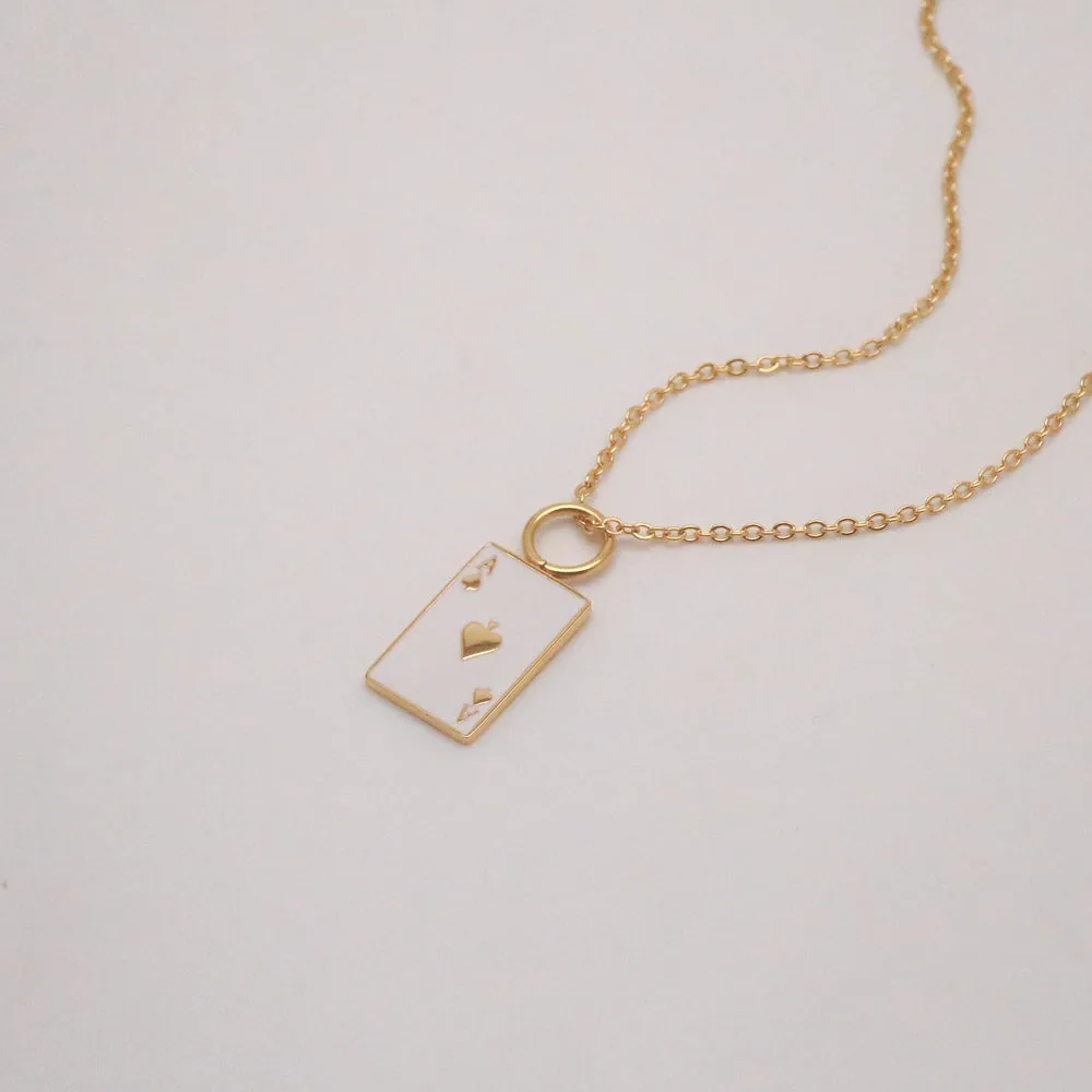
The single biggest upgrade you can make costs nothing: shoot next to a large window, in the shade of daylight, and turn off every lamp in the room. Mixed light (warm bulbs plus cool daylight) is what makes colors go muddy and impossible to correct later. I set my little table sideways to the window so the light rakes across the piece rather than blasting it head-on — that raking angle is what gives gold its warmth and a pendant its dimension.
Then comes the trick almost nobody bothers with: a white foam-board bounce. Prop a piece of white foam board (a couple of dollars at any craft store) on the shadow side of the piece, angled to catch the window light and throw it back in. It fills the dark side, softens harsh shadows, and instantly makes a photo look "shot," not "snapped." For background, keep it dead simple — a sheet of matte white or warm off-white paper curved up behind the piece so there's no hard seam. Skip busy props, marble slabs, and dried flowers for your catalog shots. Save the styling for social; your product page needs clarity, and your Social Media Content Calendar is where the lifestyle mood shots belong.
Dial in your iPhone (the settings that actually matter)
You do not need a pro camera app, but you do need to stop letting the phone guess. First, turn on the grid (Settings → Camera → Grid) so you can center pieces the same way every time. Second, tap the screen right on the jewelry to set focus, then hold and drag the little sun icon down a touch — tiny pieces fool the auto-exposure into blowing out the metal, and pulling exposure back keeps the detail in your gold.
The rule I am most militant about: never use digital zoom. Pinching to zoom just crops and softens your image. Instead, physically move the phone closer, or shoot a bit wider and crop later on a real screen. If your macro-capable iPhone lets you get within a few inches, wonderful — that's where dainty pieces from the necklaces and earrings categories really come alive. Steady the phone on a cheap tripod or even a stack of books; hand-shake at close range is the number-one reason home shots look faintly out of focus without you knowing why.
Tame glare on gold & CZ, then lock your framing
Shiny is the whole challenge with jewelry. Polished gold-plating and faceted CZ act like little mirrors, so they'll reflect the window as a hard white blob or catch your own reflection. The fix is diffusion: hang a sheet of thin white tissue, tracing paper, or even a white shower curtain between the window and the piece to spread that light into a soft glow. Rotate the piece a few degrees between frames — glare lives at one specific angle, and a small turn moves it off the stone. For very reflective CZ, I sometimes tent the piece loosely with white paper on three sides so it only sees soft white, which reads as clean sparkle rather than a harsh flash.
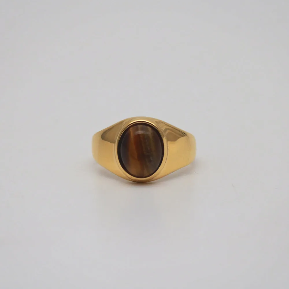
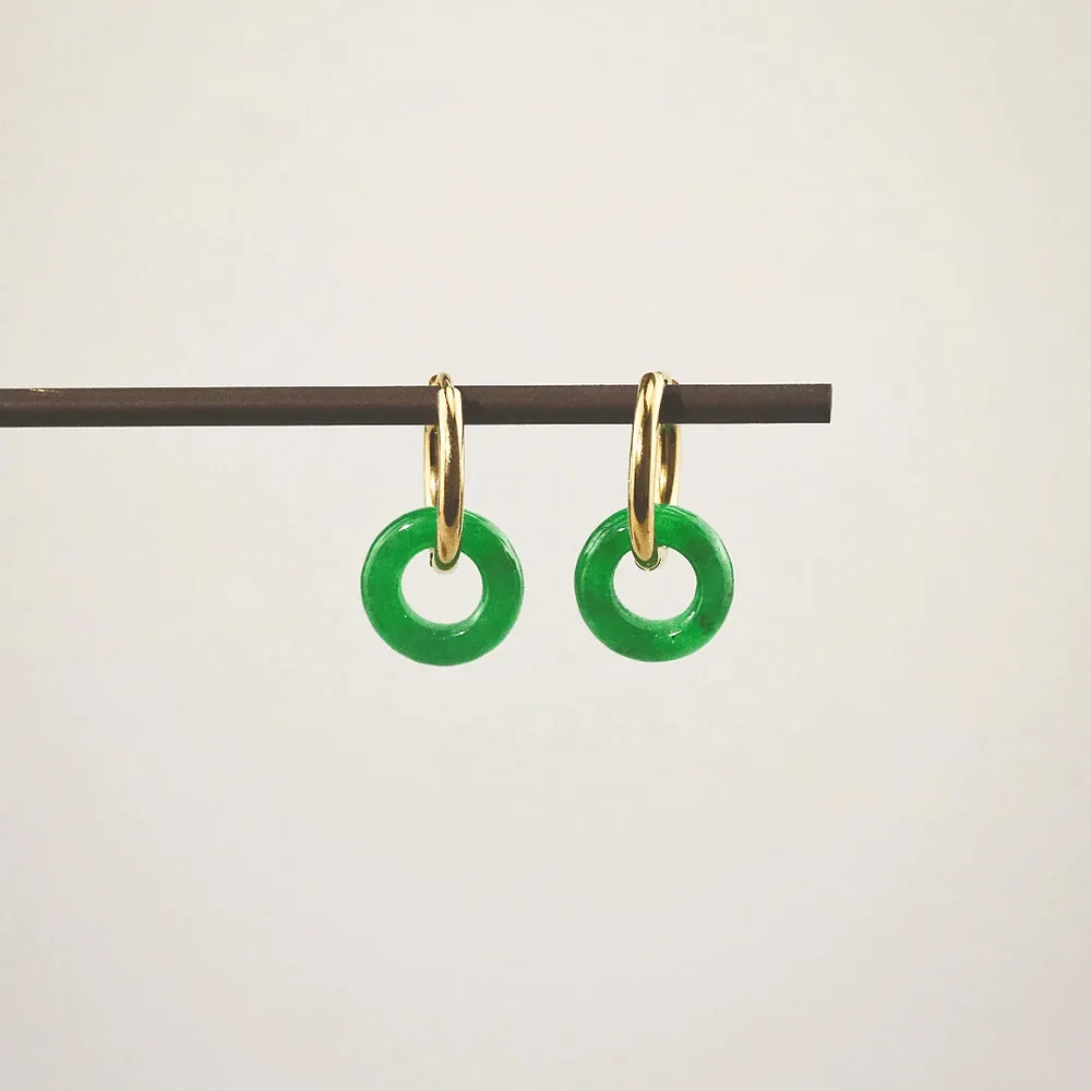
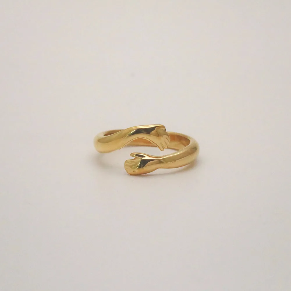
Consistency is what turns a pile of photos into a catalog. Decide once: same background, same camera height, same distance, piece centered on the grid, same orientation (I lay necklaces in a soft open teardrop, earrings as a mirrored pair, rings at a slight three-quarter angle). Mark your table with a bit of tape so every piece lands in the same spot. When a shopper scrolls your rings or bracelets page and every thumbnail is framed identically, the whole line looks intentional and trustworthy — the same principle behind how you'd display & merchandise jewelry on a physical shelf.
Edit honestly, and batch the whole shoot
Editing should make the photo look like the real thing on a real neck — nothing more. In the Photos app I nudge three sliders: Brightness/Exposure so the whites read clean, Warmth/White Balance so 18k gold-plating looks like the warm gold it is (not brassy, not bleached), and a touch of Contrast for pop. That's it. Please do not crank saturation to fake a richer stone, paint in "diamond fire" that CZ doesn't throw, or shift a dyed mother-of-pearl to a color the customer won't receive. Over-editing is how you earn returns and one-star surprises. The most profitable photo is the one that matches the package when it arrives.
Finally, batch. Set the station up once and shoot everything in one sitting — I'll do 30 to 40 pieces in an afternoon without moving the light. Photograph in the same order you'll edit, keep a simple checklist so nothing gets skipped, then edit as a batch by copying your adjustments from the first good frame onto the rest. Batching is the difference between "I'll get to photos someday" and a catalog that's actually finished and live. And live is where it earns — see the bigger picture in How to Run a Jewelry Boutique.
Your iPhone jewelry photo kit & settings
| Element | How to set it up | The result |
|---|---|---|
| Light | Big window in daytime shade, all lamps off, table turned sideways so light rakes across the piece. | Soft, even, true-color light with warmth and dimension — no muddy mixed-light casts. |
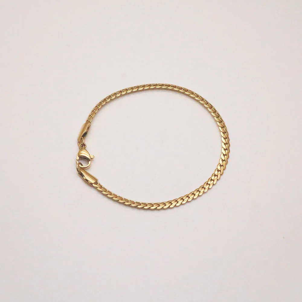
| Background | Matte white or warm off-white paper curved up behind the piece; no props or busy surfaces. | Clean, seamless backdrop that keeps every listing focused on the jewelry. |
| Phone settings | Grid on, tap to focus, drag exposure down a touch, no digital zoom — move the phone closer instead. | Sharp, correctly exposed frames with detail held in the metal, not blown out. |
| Glare control | Diffuse the window with tissue/tracing paper; add a white foam-board bounce; rotate the piece a few degrees. | Soft, controlled highlights on gold & CZ instead of harsh white blobs or reflections. |
| Styling/consistency | Same height, distance, centered on the grid, same pose per category; mark the spot with tape. | A cohesive grid where the whole line reads as one intentional, trustworthy collection. |
| Editing | Photos app: brightness, white balance to true gold, light contrast. No fake fire, no color-shifting. | Images that match what actually ships — fewer surprises, fewer returns. |
| Batching | Set up once, shoot 30–40 pieces in a sitting, edit as a batch by copying adjustments across frames. | A finished, live catalog in an afternoon instead of a someday-project. |
More wholesale guides
- How to Run a Jewelry Boutique (the pillar)
- Social Media Content Calendar
- How to Display & Merchandise Jewelry
- Local SEO for a Jewelry Boutique
- Browse the full wholesale line
Frequently asked questions
Honestly, no. A recent iPhone shoots more than enough resolution for web and marketplace listings. The quality of your photos is decided by light, background, and consistency — not the price of the device. Spend your energy on a good window and a bounce card before you ever think about upgrading gear.
Plain matte white or a soft warm off-white, curved up so there's no hard seam behind the piece. It keeps the focus on the jewelry and makes your grid look cohesive. Textured props and marble can look pretty on social, but for catalog shots they distract the eye and make consistent editing harder.
Diffuse your light with tissue or tracing paper over the window so it becomes a soft glow instead of a hard source, add a white bounce card on the shadow side, and rotate the piece a few degrees between frames to move the glare off the metal or stone. For very reflective CZ, loosely tent the piece with white paper so it only reflects soft white.
Edit only for accuracy: brightness, white balance so gold-plating reads as true warm gold, and a touch of contrast. Never paint in sparkle or "diamond fire" that CZ doesn't actually throw, and never shift a stone or dyed shell to a color the customer won't receive. Photos that oversell the product just come back as returns and disappointed reviews.
Lock in one background, one camera height, one distance, and one pose per category, then mark the spot on your table with tape so every piece lands identically. Shoot in batches and copy your edit adjustments across the whole set. Consistency is what makes a scroll through your listings feel like one collection instead of a random pile.
Couture's Corner has a $100 minimum order, and we offer NET-60 terms at 0% interest so you can photograph, list, and start selling before the invoice is due. Your first order ships with free returns, so you can handle the real pieces, shoot your catalog, and keep what works with no risk.
Open a Couture's Corner wholesale account
Good, honest photos sell the stock you carry — so stock pieces worth shooting. Get the full picture in How to Run a Jewelry Boutique, then browse the wholesale line. Our demi-fine jewelry is 18k gold-plated over 316L stainless steel with nickel-safe wear, backed by a 1-Year Color Warranty. $100 minimum · NET-60 terms · first order ships with free returns.
Open a wholesale account →